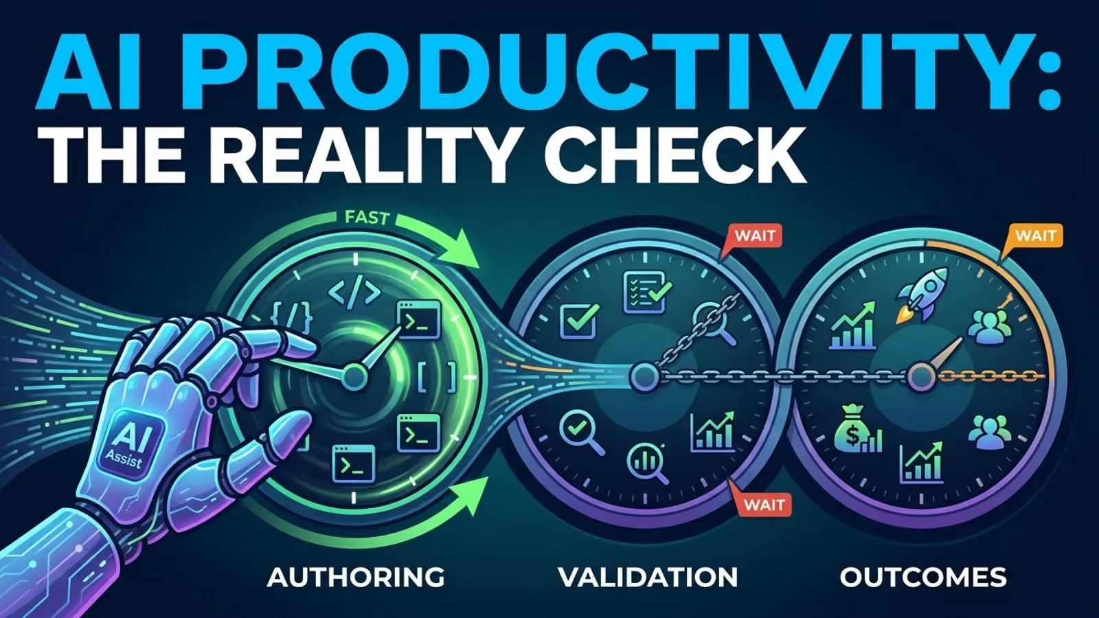
Sooner or later, someone asks for the number. It might be a vice president, a board member, or a new head of engineering just a few weeks in. The question is always the same: Can we have a single metric for developer productivity? The person responsible for the tools usually stays quiet, because saying no sounds defensive, but saying yes means building a leaderboard.
The question never explains why it’s being asked. Maybe it’s to improve delivery, defend a budget, spot a stalled team, or decide on promotions. These are four different issues, and only one is really about an individual.
Back in 2003, Martin Fowler pointed out that writing more code doesn’t mean you’ve built something useful, and that smaller solutions are often better. Twenty years later, we’ve swapped lines of code for commits, story points, and AI suggestions. It’s the same idea, just with a new dashboard.
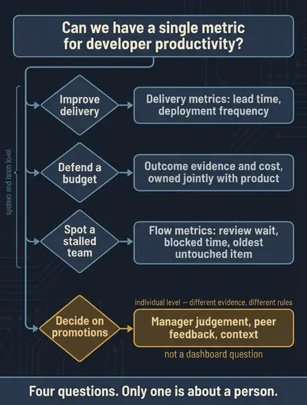
Start with the decision, not the dashboard
Before picking any metrics, sum up your decision in one sentence you’d feel comfortable saying out loud at a standup.
We have to find out if the review queue is delaying safe delivery.
Or maybe you want to know if the money spent on faster test infrastructure is paying off. Sometimes, you just need to find out why three people said their week was full of constant context switching.
Each of these points needs a different tool. If the real issue is performance management or headcount, just say so instead of calling it a productivity problem. Otherwise, measurement programs lose support.
Effort, output, outcome, impact - pick the right one
People often lump all four together under one word, but separating them early on clears up most debates.
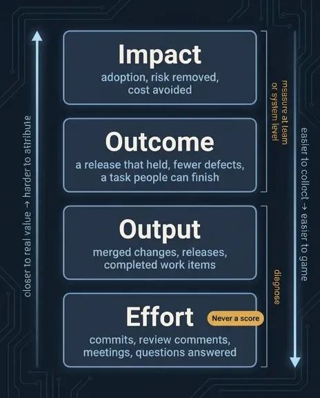
- Effort covers things like commits, review comments, meetings, and answering questions. It gives helpful context and is usually tracked without a score.
- Output means merged changes, releases, and finished work items.
- Outcome is about what changed for the user or system, such as a successful release, fewer bugs, or a task people could finally finish.
- Impact matters most: adoption happened, risks were removed, and costs were avoided.
The closer you get to real value, the harder it is to measure. Lower down, data is easier to collect and easier to game. The best way is to look at outcomes at the team or system level, and only check effort and output if you need to explain an outcome. Use activity data to troubleshoot, not to rank people.
GitHub’s Good Day study showed that pushes, commits, pull requests, and issues only explained a small part of what made developers report a good day. The people opening the most pull requests weren’t the ones having the best days.
Three lenses, plus a guardrail
No single framework covers everything, but three complementary ones released between 2021 and 2023 get you most of the way there.
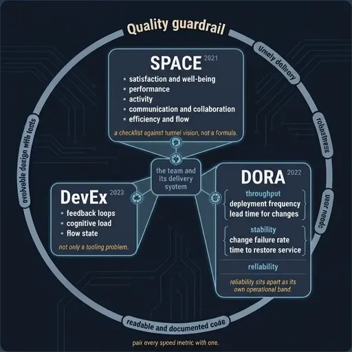
The SPACE framework breaks productivity into five parts: satisfaction and well-being, performance, activity, communication and collaboration, and efficiency and flow. It’s more of a checklist to avoid tunnel vision than a strict formula. The authors also warn against using activity measures alone to reward or punish people.
DevEx looks at real-world frustrations like feedback loops, cognitive load, and flow state. How fast does the build give feedback? How much do you have to remember just to change one line of code? Can you go an hour without interruptions? The authors also say this isn’t just a tooling problem; clear goals, psychological safety, and realistic deadlines matter too.
DORA, the Accelerate State of DevOps research, assesses the delivery system using deployment frequency, lead time for changes, change failure rate, and time to restore service. Deployment frequency and lead time measure throughput; change failure rate and time to restore service measure stability. The 2022 report added reliability, meaning whether services meet user expectations for availability and speed. DORA’s 2023 report found an association between high-quality documentation and 25% higher team performance, an association, not proof that buying a docs tool will boost your team’s performance by a quarter.
Quality is another key factor, even if speed metrics don’t mention it directly. A 2022 study found that developers and managers define productivity differently, with some focusing on activity and task completion and others on outcomes, but they mostly agree on what quality means: timely delivery, robust code, meeting user needs, readable and well-documented code, and designs that can evolve with tests. For every speed metric, include a quality measure too.
Developer efficiency metrics find friction, not slackers
Flow metrics answer one question: Where does the work get stuck?
- time from review-ready to first substantive review;
- build queue time and test duration;
- flaky-failure rate, because a signal nobody trusts is a broken loop;
- blocked time waiting on another team’s decision;
- work in progress, and the age of the oldest untouched item;
- time from a clean checkout to something running.
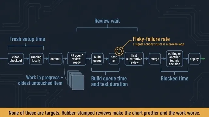
These metrics aren’t meant to target people. Shorter review times aren’t always better; some review time is necessary. If a team just approves changes to improve their queue chart, they’re making the work worse, even if the numbers look better.
Interruptions need special attention. A study of 4,910 tasks by 17 developers found that context mattered more than the task itself, things like the type of interruption, time of day, and what was being worked on. The study also showed that self-interruptions could be more disruptive than outside ones, even though a separate survey of 132 developers expected external interruptions to be worse. Another Microsoft study with nearly 6,000 responses found meetings were unproductive during development but helpful for planning and release. If you count interruptions without context, the numbers don’t mean much.
The numbers can’t see everything
Google studied 622 developers from three companies to see what affected their self-rated productivity. The strongest links weren’t technical; they were things like having a positive attitude, colleagues who listen to new ideas, getting useful feedback, having varied tasks, and working remotely. The study was based on self-reported data, so it’s not a universal rule, but no event stream can capture these factors.
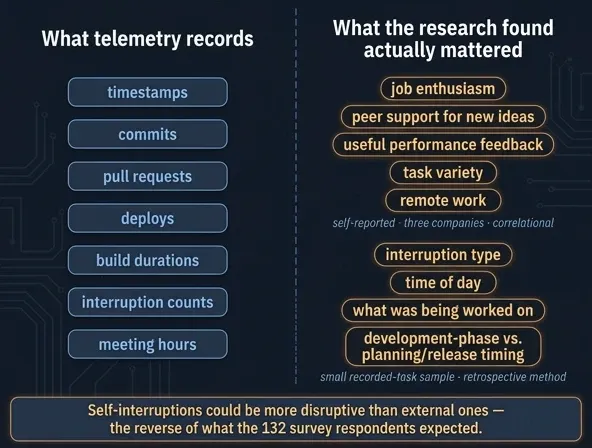
Run a quick survey alongside your telemetry. Keep the questions the same long enough to spot trends, and record both the range of answers and any free-text comments, not just a single score. Treat the survey as an intervention; one 2023 field study found that simply asking teams about productivity raised their ratings and awareness, without generally increasing cohesion or affecting well-being. Measuring is part of the system itself.
What a dashboard should actually show
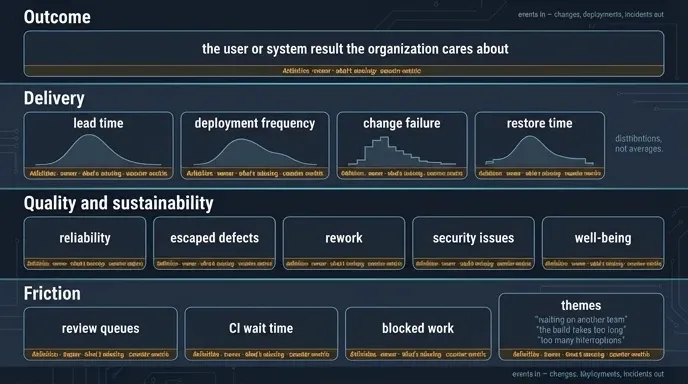
You only need four main categories, not forty different charts.
- Outcome: the result that the organization is concerned about regarding the user or the system.
- Delivery: in terms of distributions rather than averages, including lead time, deployment frequency, and change failure, as well as restore time.
- Quality and sustainability: reliability, defects that have escaped, the need for rework, security issues, and well-being.
- Friction: the review queues, the waiting time for CI, work that is blocked, and the various issues raised when you ask people.
Next to each chart, include its definition, who owns it, what data is missing, and a counter-metric to prevent local optimization. The Four Keys, Google’s open-source pipeline from 2020, is a good example: it takes in repository and deployment events and outputs changes, deployments, and incidents. Its documentation points out that computed metrics need clear definitions and value judgments, which surveys don’t require.
The real work is what happens, not just what’s on the charts.
Why individual scores backfire
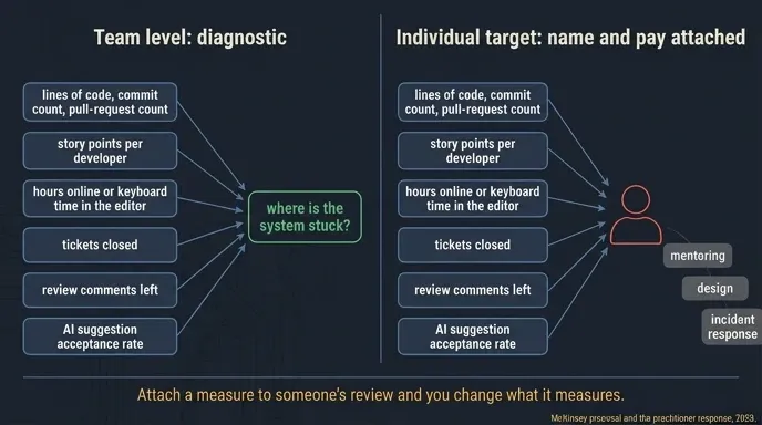
When you tie a measure to a review, it changes what you’re really measuring. This was a big topic in 2023 after McKinsey suggested combining DORA, SPACE, contribution analysis, and inner-loop time at the system, team, and individual levels. Practitioners pushed back; Gergely Orosz and Kent Beck argued that activity and output aren’t the same as business impact, and the first question should be who has power over the person being measured.
The usual suspects, roughly in order of how often somebody tries them:
- lines of code, commit count, pull-request count;
- story points per developer;
- hours online or keyboard time in the editor;
- tickets closed;
- review comments left;
- AI suggestion acceptance rate.
All of these can work at the team level, but once you tie them to individual names and pay, they start rewarding the wrong things. Mentoring, design, and incident response get ignored.
What I expect next
- Instead of using a single composite score, dashboards will have multiple layers with the different factors, delivery, friction, and quality, shown side by side.
- Telemetry and input from developers will be used together, since the timestamps and the ‘was I blocked?’ response answer different questions.
- The metrics relating to individual activity will tend to be used for diagnostic purposes as it becomes more difficult to justify the ranking criteria.
- The definitions in metric terms will become a platform feature, since aspects such as event lineage, identity resolution, and definition versioning will be just as important as charting.
- AI-assisted development raises the stakes on outcome measurement. DORA called AI’s impact on teams still in its infancy this year; as adoption grows, suggestion acceptance will look thin next to end-to-end task time, review burden, and defects.
Measure the work system so you can make it better. The most useful number isn’t the one that shows who your top developer is; it’s the one that tells you which queue to fix on Monday.